Foot Locker UI/UX Redesign
I made an overhaul of the internal order system that Foot Locker uses to handle business to customer orders. The goal was to create a modern, user-friendly while maintaining the 'Striper' identity.
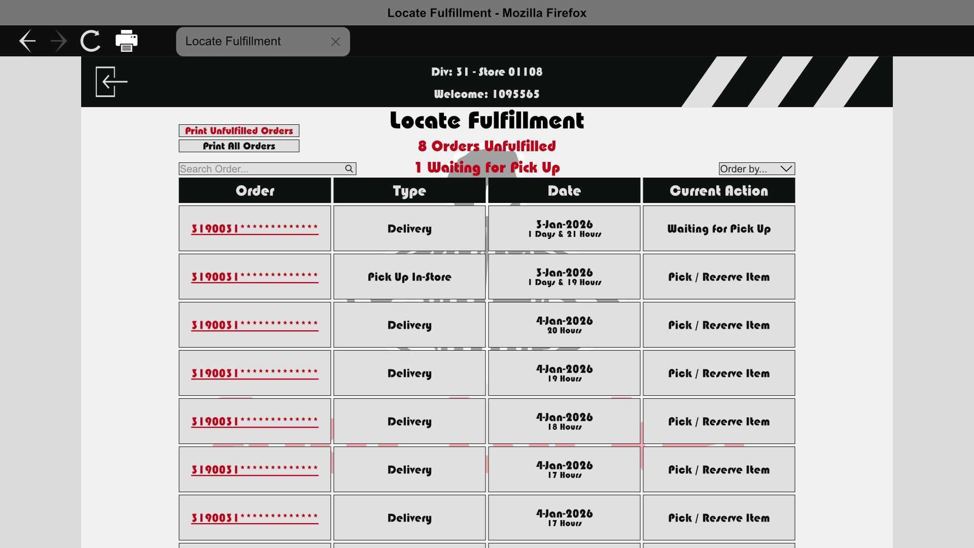
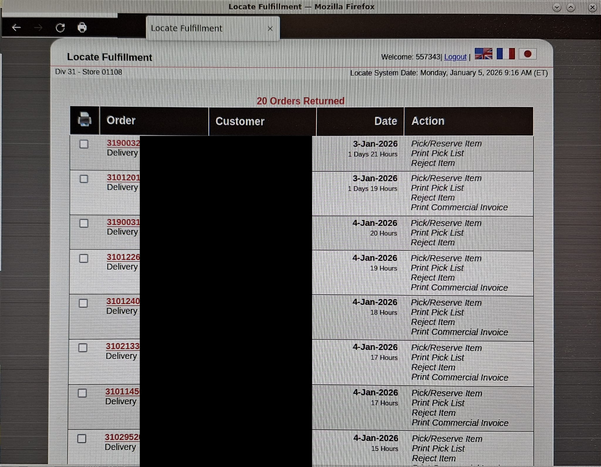
Order List
According to employees, the order list was unnecessarily complicated and contained too much customer data cluttering the screen. I solved this by adding tools like a search bar, sorting options and improve the printing function. Additionally, I added a value to the actions list that tells users if the order is ready for pickup. To solve the clutter issue I removed the customer information and gave each datapoint its own individual block to improve readability. To top it off, I also updated the UI to be more in line with the Foot Locker 'Striper' identity.
Use the sliders below to compare the old version (left) to the updated version (right).
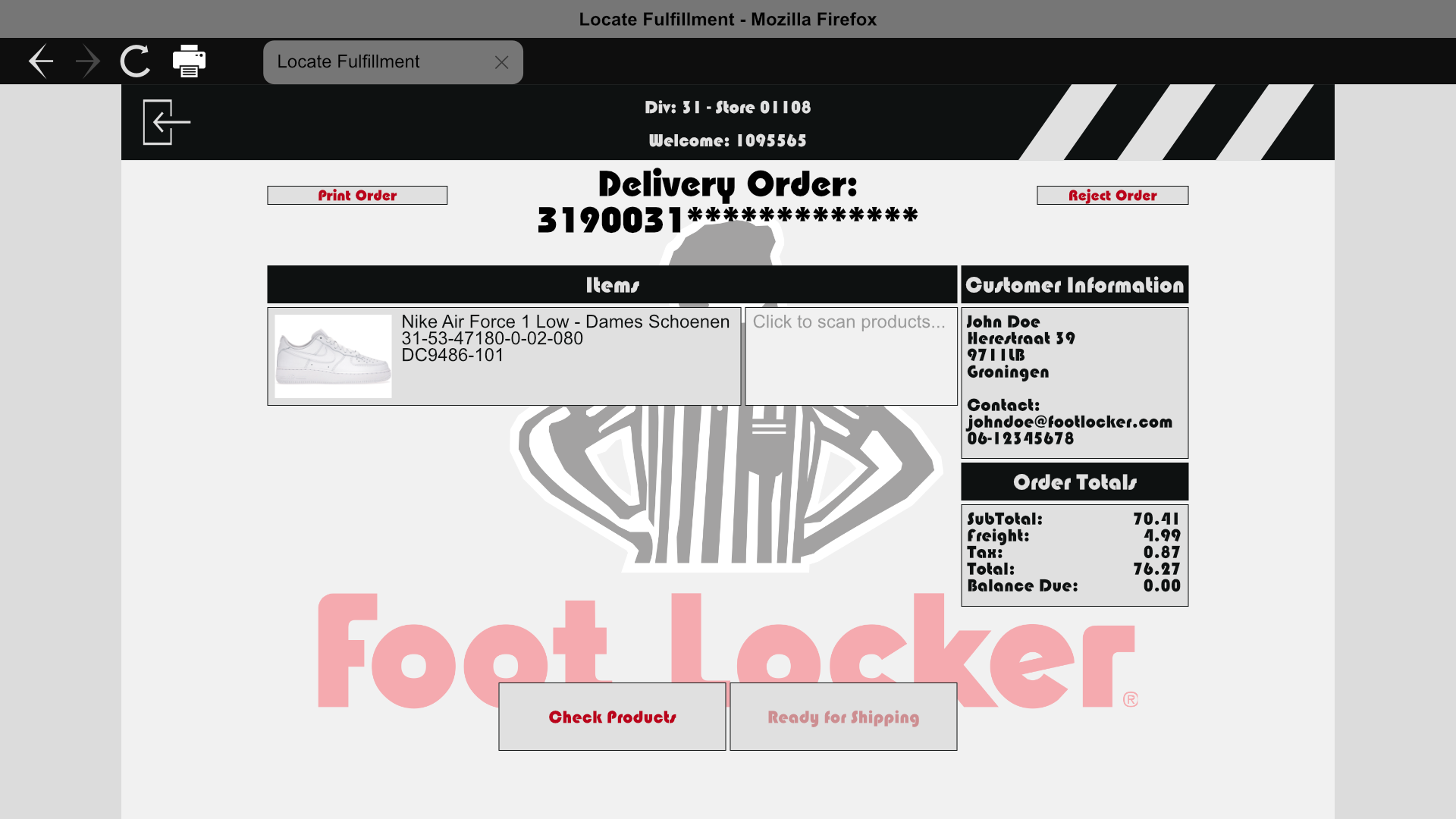
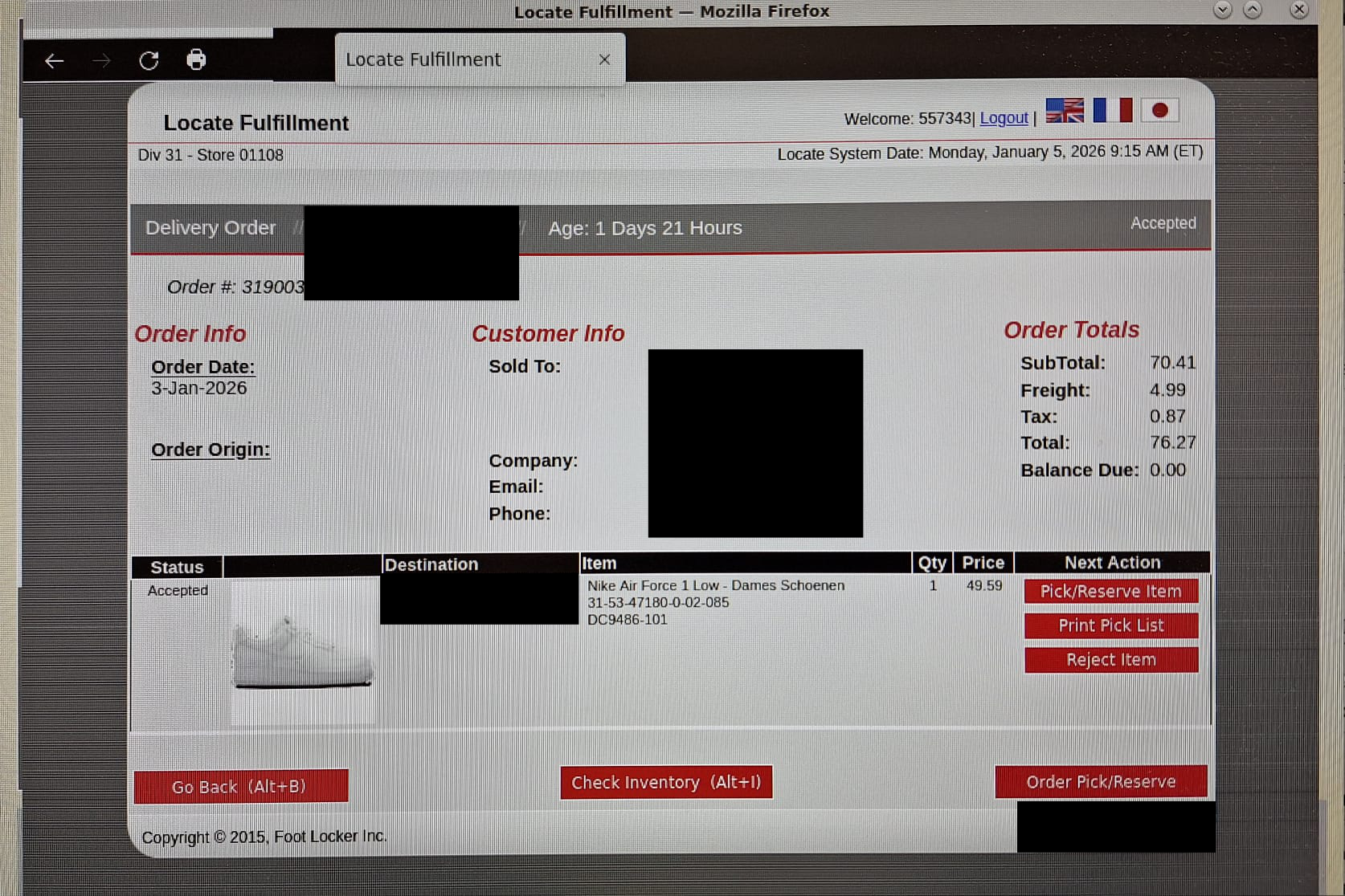
Order Details
I maintained the same standards as with the order list, however this section was even more cluttered with buttons employees did not use. I removed several buttons that were redundant according to users. I once again gave the page the 'Striper' identity overhaul and streamlined the picking process by adding a scan-box to the main page.
< Back